Designing a Contextual Side Panel for AI Management Platform
Enterprise AI Ecosystem | Data Insight & Interaction Design | Shipped 2025
Project overview
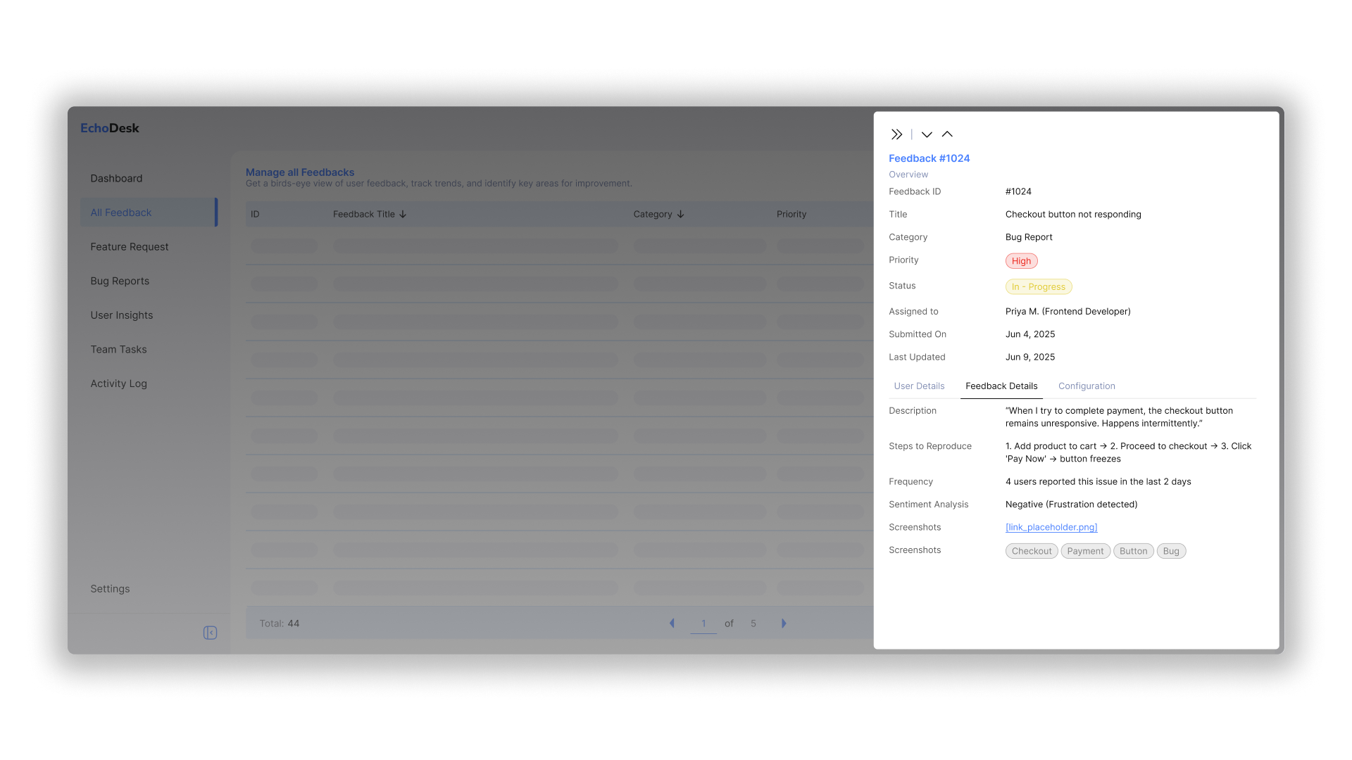
Designed a contextual side panel for an enterprise AI management platform, enabling users to view, edit, and act on complex data without losing context. Enhanced discoverability, task efficiency, and interaction depth across data-driven workflows.
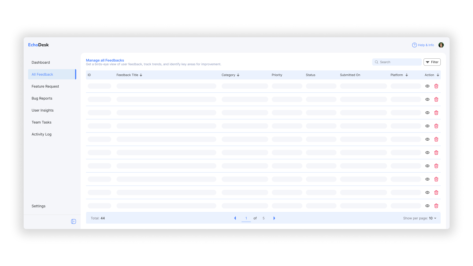
The project focused on designing a contextual side panel within an enterprise AI management platform that supports complex workflows and data exploration.
The goal was to allow users to access key details, manage entities, and perform quick actions without navigating away from their main workspace — enhancing efficiency and reducing cognitive load.
Product
Web Application
My Role
Product Designer — UX Strategy, Interaction Design, and Visual Systems
Skills
Information Architecture, Prototyping, Data Visualization, Design Systems
Impact
Reduced task switching, improved efficiency, and increased contextual engagement
Introduction
In large-scale AI platforms, users frequently toggle between datasets, configurations, and analytics panels. This led to fragmented workflows and reduced productivity.
The side panel was introduced as a unified contextual space that adapts based on the user’s task — whether reviewing data, modifying configurations, or checking performance summaries.
Problems & project goals
Users lost context when switching between pages, causing workflow disruption and slower task completion.
Information was scattered across multiple views, making it difficult to connect related data.
Goals: minimize navigation friction, surface contextually relevant information, and create a scalable structure for future data modules.
Opportunity
The side panel offered an opportunity to centralize quick insights and actions — creating a single source of contextual truth.
By designing adaptive layouts and modular components, the system could scale across multiple product areas while maintaining consistency and usability.
Final designs
The final design introduced a structured panel layout that dynamically adjusts to context — supporting multiple entity types and data densities.
Refined visual hierarchy, consistent iconography, and contextual action grouping improved clarity and workflow continuity.
Interactive prototypes helped validate the design’s performance and responsiveness under real user scenarios.
Outcomes & impact
User testing showed a 32% improvement in task completion time and a significant reduction in navigation errors.
The design system patterns introduced here were later reused across related modules, improving design efficiency by 40%.
The panel became a core interaction model for contextual workflows across the platform.
Takeaways
Designing for context requires balancing visibility and simplicity — too much information can overwhelm, too little can frustrate.
A modular, system-oriented approach not only improved this product’s usability but also accelerated adoption across teams.
The side panel demonstrated how thoughtful information architecture can turn complex systems into approachable, efficient experiences.